Graduate Studio: Technology A [Class Notebook] (DES-720A-02)

Week 9: Object Oriented

We are continuing our exploration of data by diving deeper into APIs and how to fetch data from external sources. Additionally, we will introduce the concept of Object-Oriented Programming (OOP) to help organize our code better and make it more modular.


https://www.instructables.com/Data-Crystals-3D-Data-Visualizations-from-Open-Dat/ 
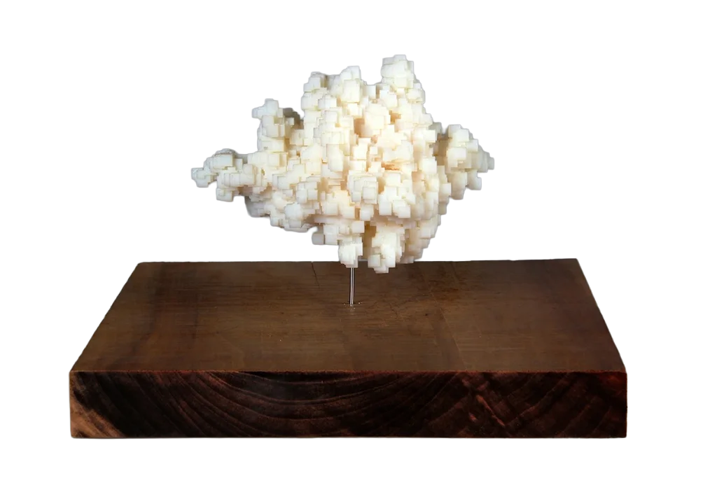
(Data Crystals - Scott Kildall)

Object-Oriented Programming allows us to create objects that encapsulate data and behavior, making our code more reusable and easier to manage. We will discuss how this paradigm can be applied in our data sculpture projects.


Edit this page on GitHub

Using Opensheets as API

Assignment

Due: Oct 28, 2025

Submit Assignment

This week, you will continue working on your data sculpture project. Think about how your data can be turned into both a digital and physical object. Consider using Object-Oriented Programming to structure your code and make it more modular.

Readings

I found this interesting article that construct these crystal-like data sculptures from open data.

Examples

Tutorials & Resources

Class Notebook

Bella Tsai

I learned to use coding to create a visual structure for further design. However, I still need to improve my work. Perhaps I should include other boroughs as well, and how to correctly label the species is also something I need to continue working on. The only difficulty I'm currently facing is that I cannot successfully download the SVG file from p5.js, even though I follow every step to do it.

Binjia Li

I learned how to visualize real-world data in p5.js by using colors, animation, and size to show information in a creative way. For example, Map data to visuals: Used map() to turn numbers into circle sizes. Add color & motion: Applied a color palette and sin() animation for smooth movement. Organize code: Used setup() once and draw() to loop animation.

Flora Fang

This week i learned how to export the model as an STL file , and decided how to make it physically. But I'm still working on how to make the terrain into an irregular shape to look like the outline of Manhattan.

Kate Chon

I learned how to transfer my data into Google Sheets and link it so it updates automatically without needing manual edits

Lin Kim

I learned how to implement custom map visualization using the Canvas API. By building map rendering, zoom/pan interactions, and marker displays from scratch with pure JavaScript and Canvas 2D Context without relying on external map libraries, I gained a deeper understanding of low-level graphics processing and coordinate transformation logic. Additionally, I applied optimization techniques to efficiently render large-scale location data, which gave me firsthand experience with the importance of performance management.

Lina Lee

It was quite hard to make my narrative in cohesive way.

Nancy Scanlon

I learned more about how I can use class as well as grabbing certain information from arrays. Especially in my JSON!!

Sarena Yadav

Through this project, I learned the importance of focus and concept in data collection. Shifting from recording experiences across NYC to exploring the linguistic diversity of India helped me understand how a dataset can tell a story rather than just present information. I discovered the scale of India’s languages 36 major languages in my dataset, part of over 121 recognized languages and 19,500 dialects and how arranging them from most to least spoken highlights cultural and regional diversity. I also learned how to visualize data creatively, transforming numbers into a meaningful, interactive representation that reflects identity, history, and connection.

Yiling Yang

I learned that I can use multiple design tools together to create a complete work, instead of relying only on p5.

Zoe Liu

At first, I actually wanted the leaf colors to be determined by the number of trees in each condition. I thought this would make every tree look a bit different when visualized. But in the end, I gave up on that idea, because most of the time the number of Good trees is the highest, then Fair, and Bad is usually the smallest. So the leaf colors ended up being in the same order for almost every tree. I'm not completely sure if this is always true, but it does seem to match the data. Still, if possible, I would like to add a bit of randomness to the leaf part based on the data.